share this
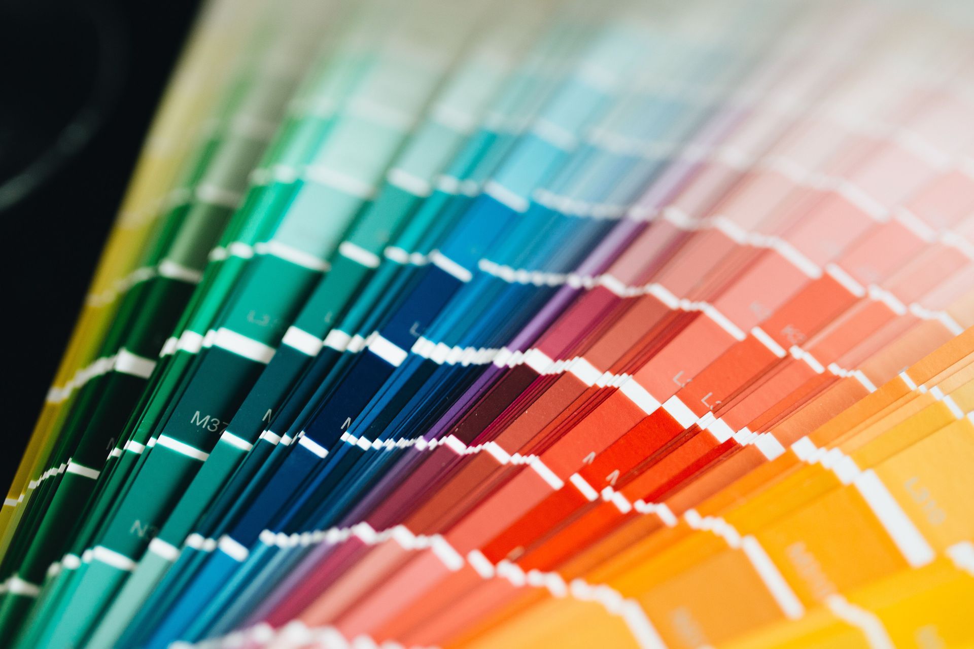
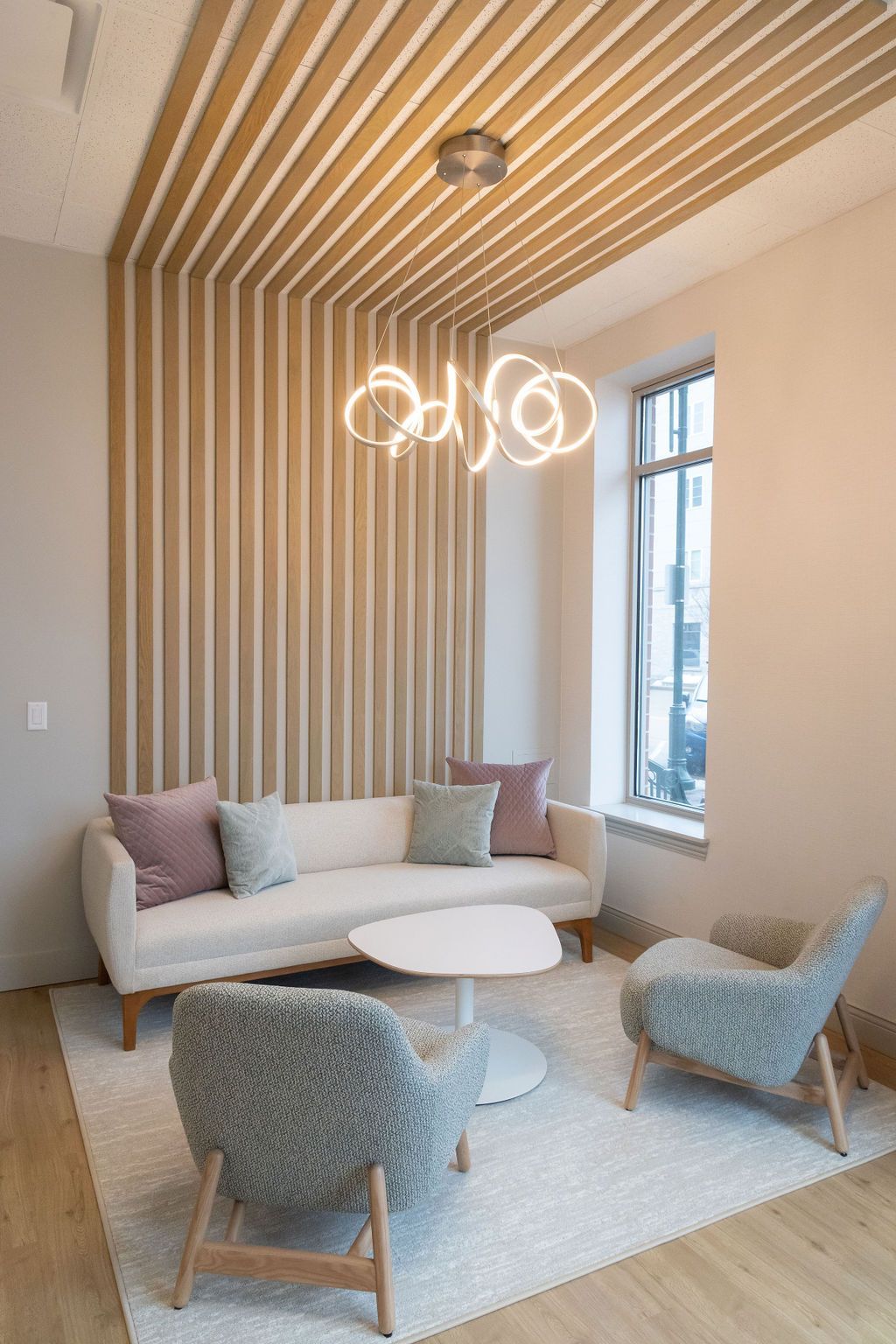
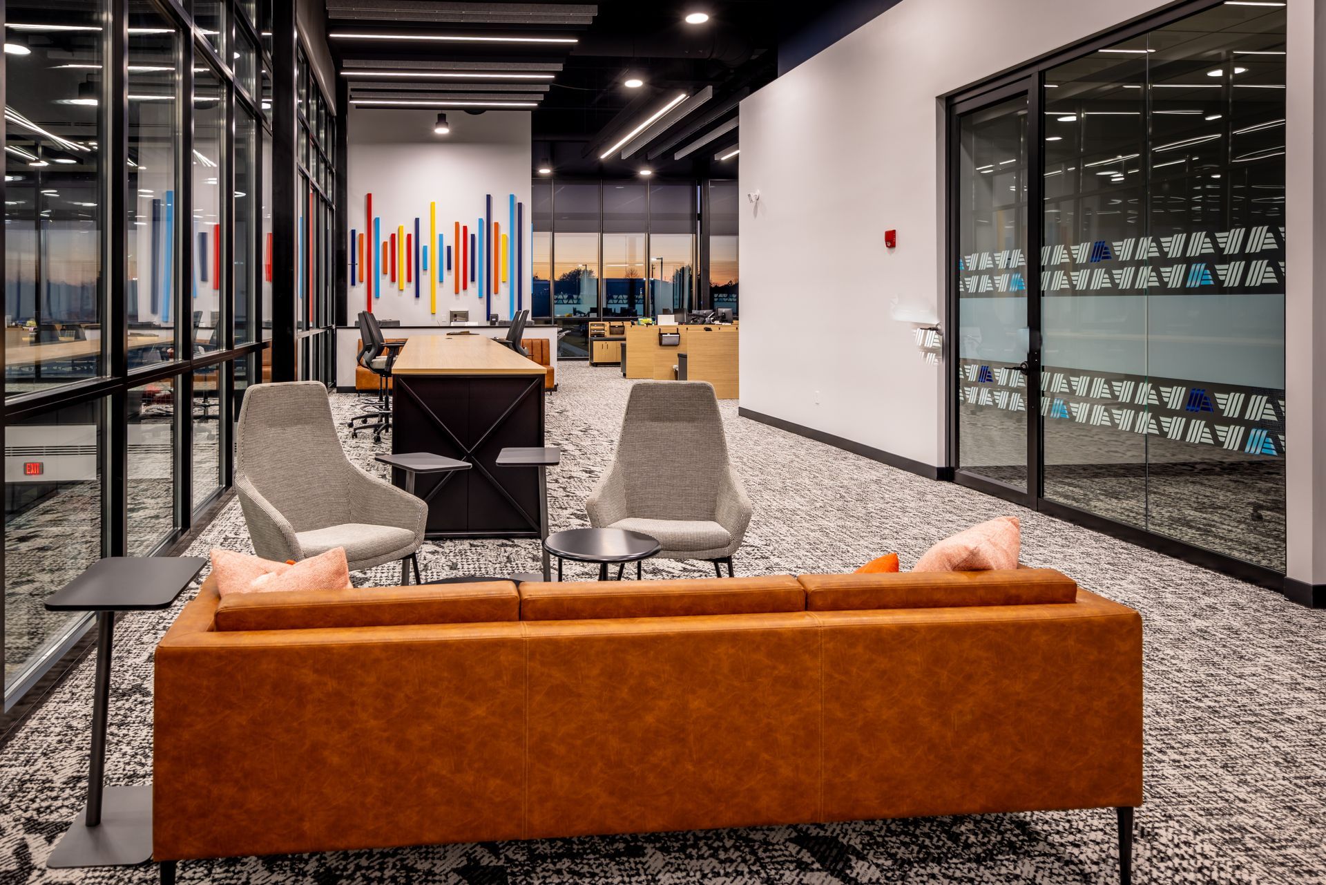
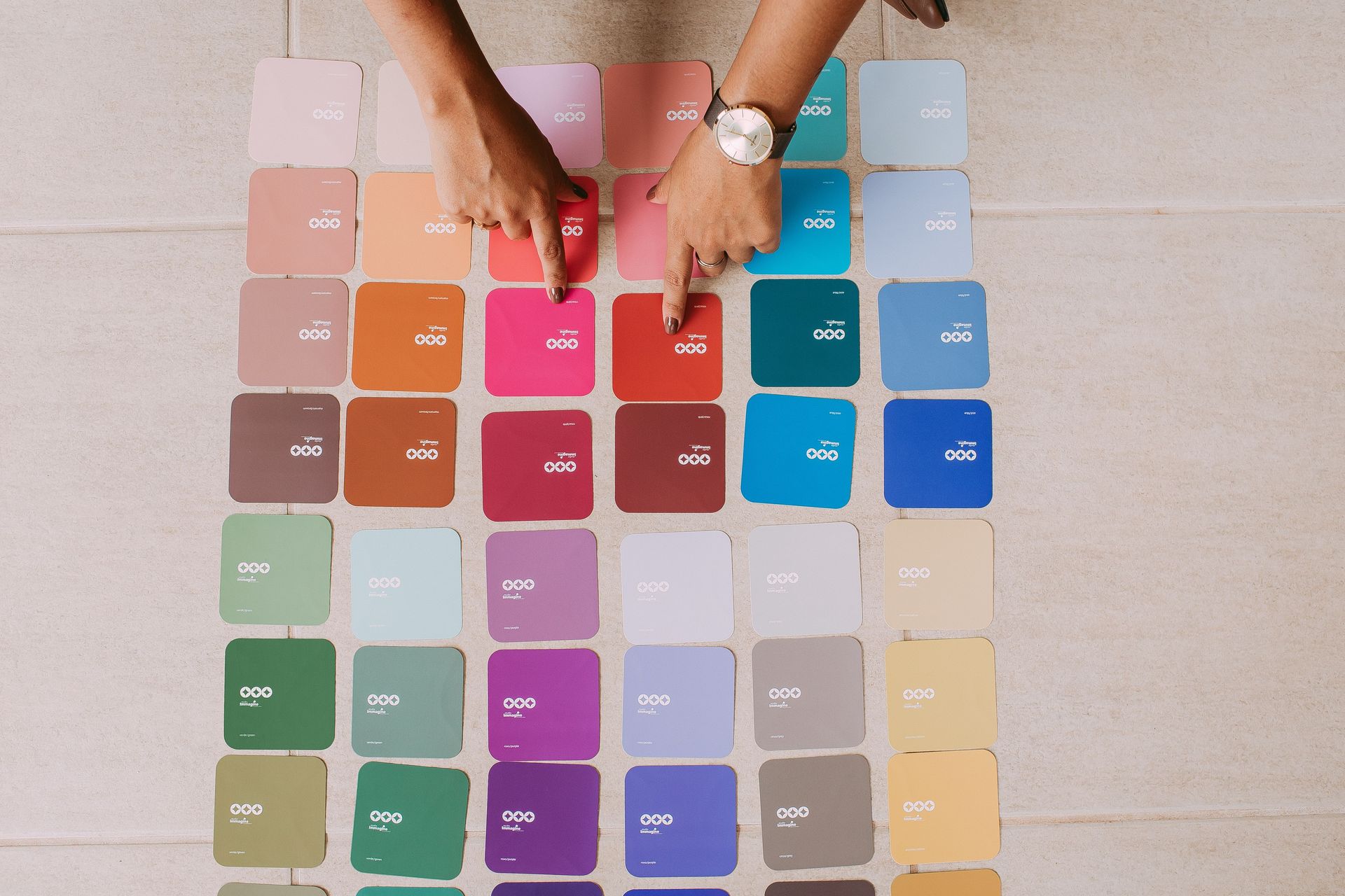
The top color trends for 2026 include warm browns, earth-inspired neutrals, restorative greens, atmospheric blues, rich reds and plums, ochre and golden yellow accents, and softer whites and khakis. Together, they reflect a broader shift toward warmer, more layered commercial interiors inspired by natural materials and lasting design. The way these colors appear also depends on lighting, surrounding materials, and the finishes used throughout the space.
Color Is Becoming More Intentional
Commercial interiors are moving away from one-size-fits-all palettes and toward colors chosen with a clear purpose. Instead of relying on safe neutrals alone, designers are layering warmer tones, natural influences, and richer accents to create spaces that feel more welcoming and memorable.
This shift reflects a
return to personality, with color becoming one of several design elements that help shape the character of a space. The following palettes capture that direction while showing how thoughtful color choices can strengthen the overall experience of a commercial interior.
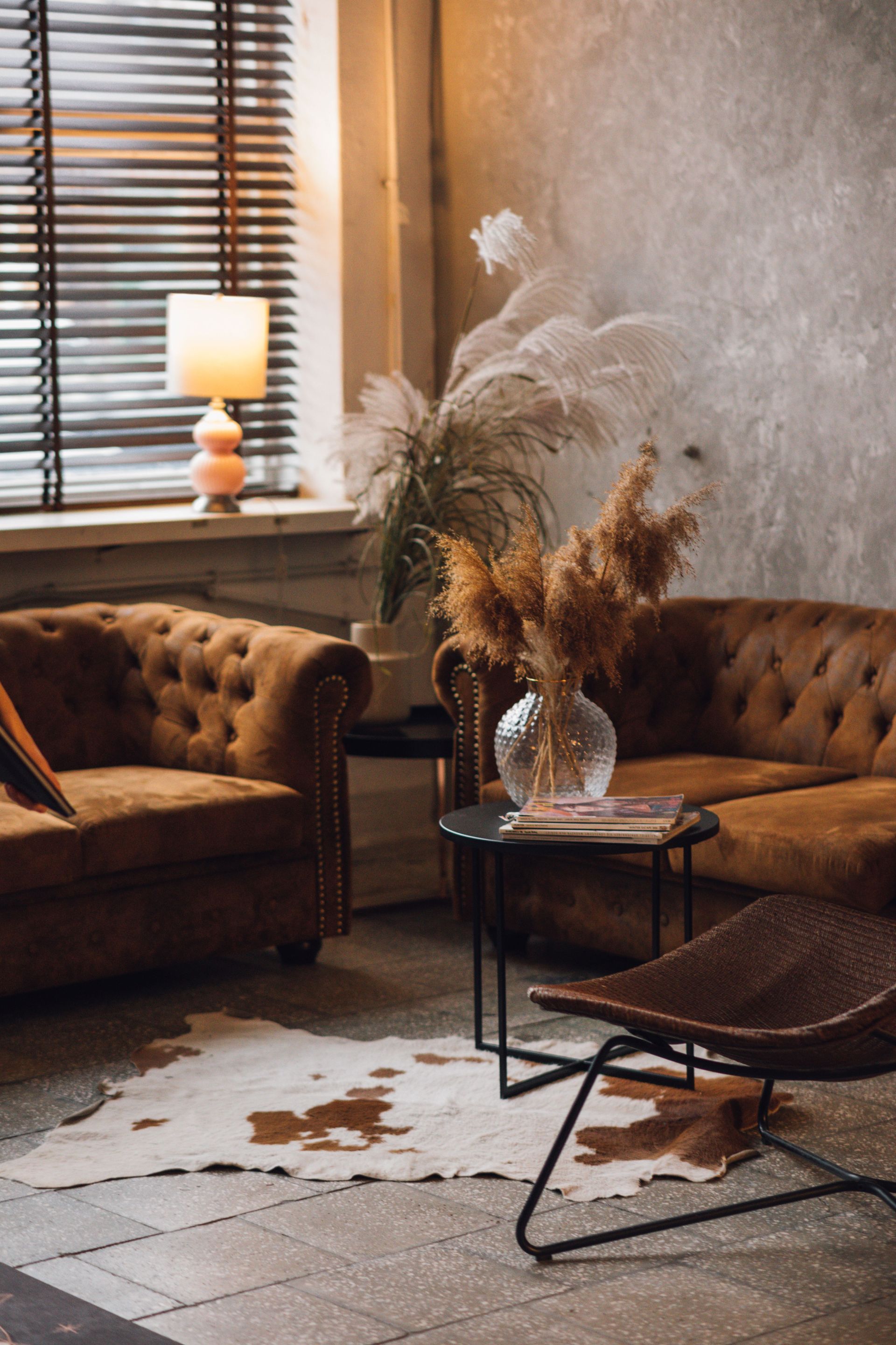
Warm Browns and Earth-Inspired Neutrals
why they are trending
Warm browns and earth-inspired neutrals reflect a broader shift toward commercial interiors that feel warmer, more welcoming, and connected to natural materials. Shades like caramel, clay, taupe, and walnut add depth without overwhelming a space, making them a natural choice for projects seeking a timeless palette with more character than cool gray.
commercial applications
Warm browns create an inviting foundation for reception areas, executive offices, hospitality spaces, and workplace lounges where comfort and professionalism go hand in hand. Their versatility also creates a strong foundation for evolving furniture selections, artwork, and brand accents without feeling tied to a short-lived trend.
Restorative Greens
why they are trending
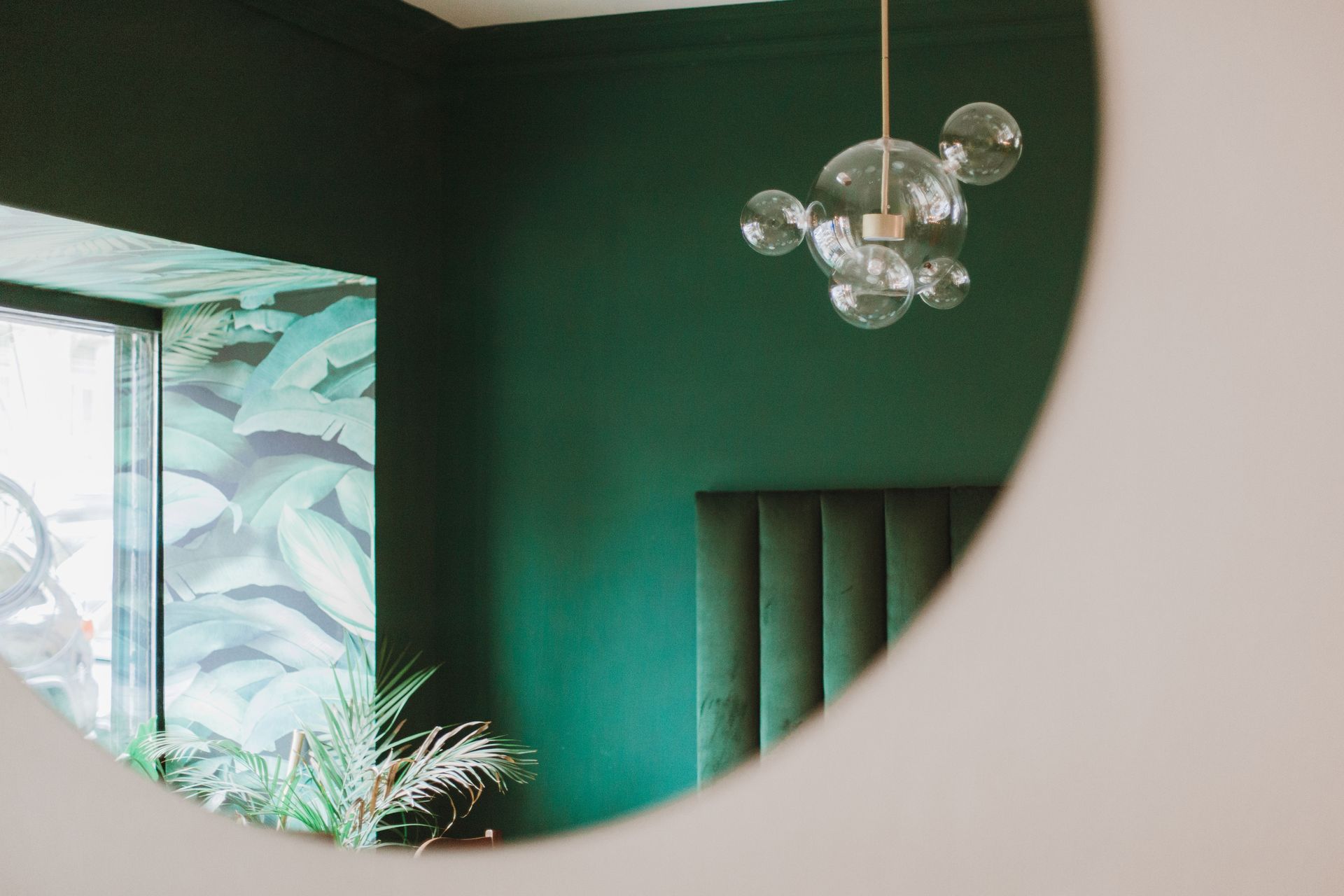
Restorative greens reflect the growing preference for commercial interiors that feel warmer, calmer, and more connected to nature. As organizations create spaces that prioritize well-being and comfort, shades like sage, olive, and moss bring depth and character while maintaining a relaxed, approachable feel.
commercial applications
Wellness rooms, breakrooms, hospitality spaces, healthcare environments, and collaborative lounges are natural settings for restorative greens. Paired with natural wood, stone, and warm metals, they create welcoming spaces that feel refreshed without relying on bold or highly saturated color.
Atmospheric Blues
why they are trending
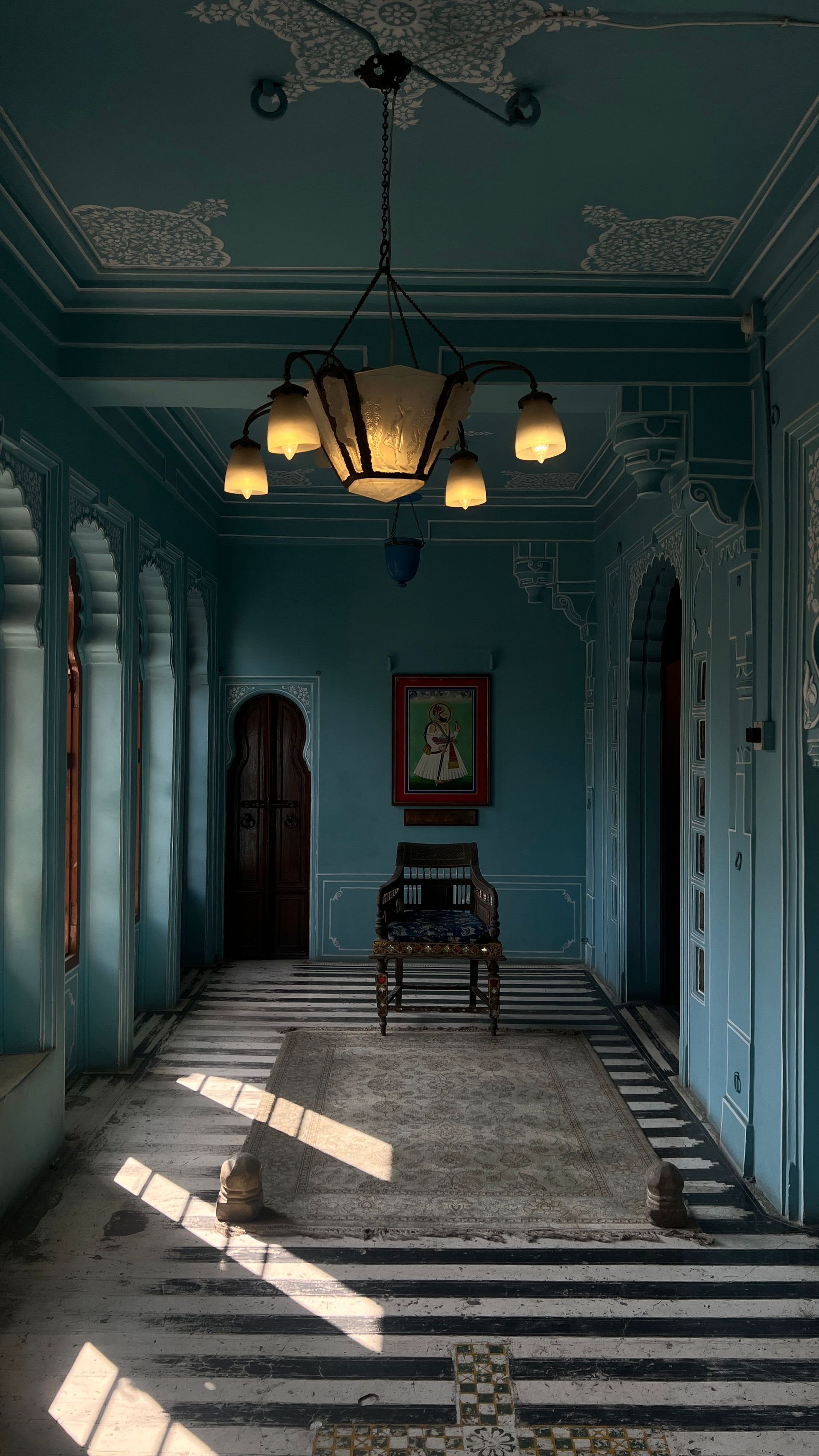
Atmospheric blues are trending as commercial interiors move beyond traditional corporate blues in favor of softer, more layered palettes. Muted sky blues, dusty blues, and blue-green tones bring a sense of calm while balancing the warmer browns, greens, and earth-inspired neutrals shaping interiors in 2026.
commercial applications
Conference rooms, focus areas, hospitality spaces, healthcare settings, and transitional spaces benefit from atmospheric blues. They create a calming backdrop while pairing easily with wood, stone, warm metals, and earth-inspired neutrals for a layered, cohesive palette.
Rich Reds, Plums, and Wine Tones
why they are trending
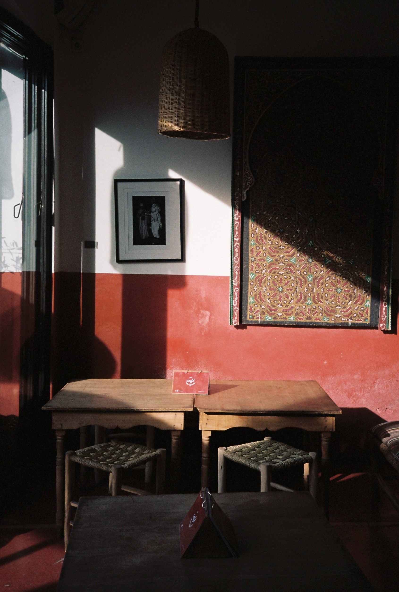
Rich reds, plums, and wine tones reflect the growing preference for commercial interiors with greater warmth, depth, and individuality. As designers move beyond minimalist palettes, these colors create memorable moments while adding richness without relying on bright, highly saturated hues.
commercial applications
Rich reds, plums, and wine tones are especially effective in hospitality spaces, executive offices, restaurants, lounges, and feature areas where a stronger visual identity is desired. Used on millwork, upholstery, accent walls, or decorative details, they create focal points without overwhelming the overall palette.
Ochre, Golden Yellow, and Sun-Washed Accents
why they are trending
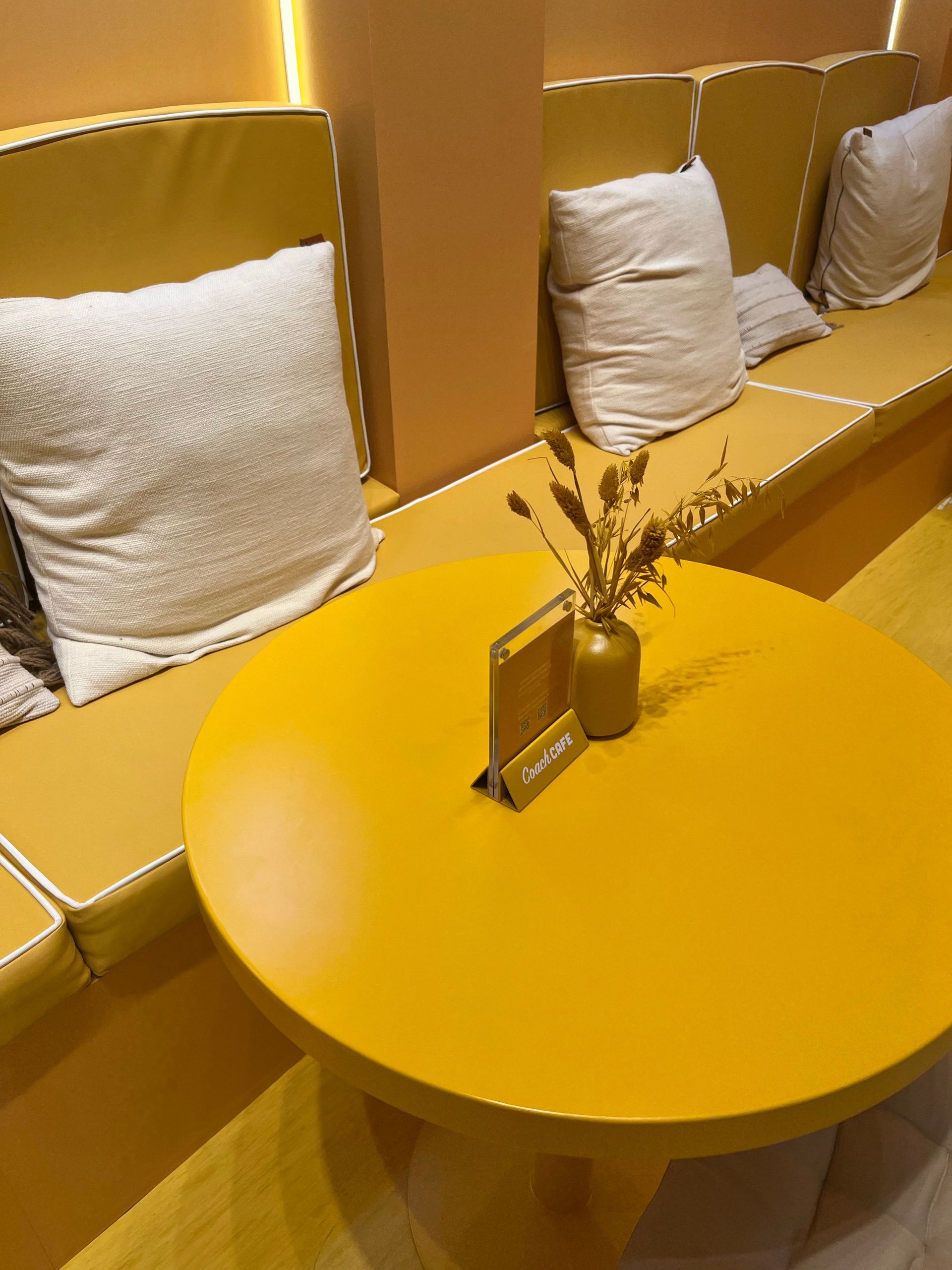
Ochre, golden yellow, and sun-washed accents are trending as designers embrace warmer, more expressive palettes that still feel grounded. These softer yellow tones introduce optimism and warmth without the intensity of brighter hues, making them an easy complement to the earth-inspired materials and layered interiors shaping commercial design.
commercial applications
Cafés, amenity spaces, collaborative areas, hospitality environments, and feature walls are ideal places for ochre and sun-washed accents. Used through upholstery, artwork, tile, or decorative accents, they brighten a space while complementing wood, stone, and other natural finishes.
Soft Whites and Updated Khakis
why they are trending
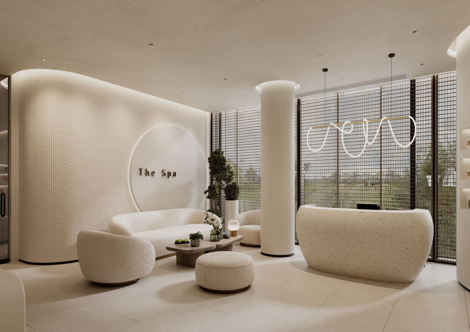
Soft whites and updated khakis are trending as designers replace stark whites and cool grays with warmer neutrals that feel more inviting. These shades create a softer foundation for layered palettes, pairing effortlessly with earth tones, rich accent colors, and natural materials found throughout today's commercial interiors.
commercial applications
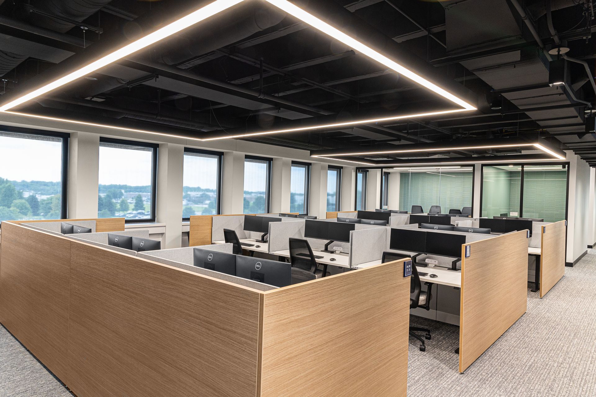
Open offices, corridors, reception areas, and shared spaces benefit from soft whites and updated khakis where flexibility is important. They create a timeless foundation that complements evolving furniture, artwork, branding, and accent colors while helping spaces feel bright without appearing sterile.
Color Drenching and Tonal Layering
Beyond individual colors, designers are also changing how color is applied throughout a space.
what it means
Color drenching uses a single color across walls, trim, ceilings, and other architectural elements to create a cohesive, immersive environment. Tonal layering takes a more flexible approach by combining lighter and darker shades within the same color family, creating depth, dimension, and visual interest through subtle variation.
commercial applications
These techniques work well in hospitality spaces, executive offices, meeting rooms, and amenity areas where a cohesive atmosphere is the goal. Layering similar tones creates visual continuity while letting furniture, textures, and architectural details contribute to the overall palette without competing for attention.
How Color Psychology Shapes Commercial Interiors
Color can influence how a space is perceived, but its effect depends on far more than the shade itself. Lighting, materials, surrounding finishes, and the way a space is used all shape how people experience color, making thoughtful palette selection an important part of the overall design process.
The strongest palettes also consider existing flooring, millwork, furniture, and architectural finishes so new colors feel integrated rather than disconnected.
In commercial interiors, color psychology should reinforce the purpose of the space rather than follow broad assumptions. A workplace, hospitality environment, healthcare facility, or amenity space may each call for a different approach, with every palette reflecting the people, activities, and atmosphere the space is designed to support.
Trends Should Support the Bigger Design Strategy
The most successful commercial interiors do not begin with a trending color. They begin with the goals of the space, the people using it, and the experience the environment is meant to create. Color works best when it reinforces those decisions instead of leading them.
A thoughtful palette should also reflect the building's architecture, lighting conditions, materials, and brand identity. When every element works together, a space can feel current without becoming tied to a single design moment or short-lived trend.
Create a Palette With Purpose
The strongest commercial interiors use color with intention. A successful palette reflects the goals of the space, complements its materials and lighting, and creates an environment that feels welcoming long after design trends evolve. When each decision works together, the result is both memorable and enduring. The best projects do not chase trends. They use them thoughtfully to create spaces that feel authentic, functional, and built to last.
If you're planning a commercial project, thoughtful color selection is only one part of the larger design process. Explore our
commercial interior design services to see how KDI creates spaces that balance function, brand identity, and lasting visual appeal.
Let’s connect to discuss your project and bring your vision to life.
connect with us
Latest Posts